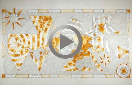
Drowned World: Buckminster Fuller Projection
This the fourth map I’ve made as part of my Mapping The Drowned World project, inspired by JG Ballard’s novel The Drowned World.
Maps are always staking a claim or making a point. Far from being an endeavour of pure science, they are political and cultural tools. They frequently represent power and the domination of both people and places.
Maps are artefacts deeply embedded in the cultures that make them and the conditions of their time. And my Drowned World maps are no exception.
In my Drowned World series of drawings I transpose a predicted ocean level rise of 70 meters on to maps of the world. These artworks picture planetary geography re-shaped in a way that echoes Ballard’s science fictional vision of The Drowned World, but they are also grounded in the real.
This map took approx 25 hours of drawing, August – December 2016
The time-consuming nature of these works is a deliberate strategy which points to our complicity in creating our current climate crisis.
This catastrophe did not just happen: it took centuries of dedicated labour, ruthless exploitation of the natural environment, manic consumerism, and blatant disregard for the consequences of our actions to reach this moment in time.
The Buckminster Fuller projection was created in 1943.
WATCH Tracey Clement create Drowned World: Buckminster Fuller Projection.
